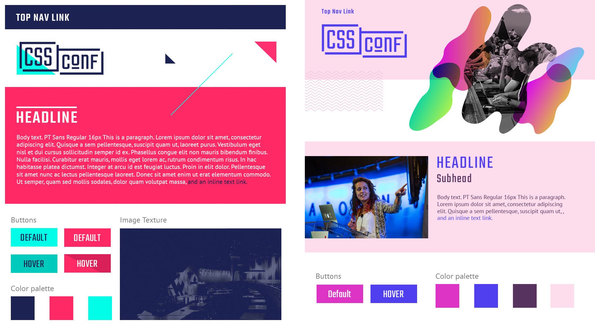
Style Tiles define
Tools
- Interview notes
- Image editing and compositing app
Why do it:
It helps come to decisions about look and feel for visual design while not getting wrapped up in page layouts, since things are responsive these days.
When to do it:
Style tiles are for when a Mood Board is too vague and a comp is too literal. Style tiles establish a direct connection with interface elements without defining layout. They are useful to design towards the beginning of your visual design work and can be done as part of the Visual Design Workshop.
Who’s involved:
Designers, Stakeholders and front-end engineers.
Time estimate:
Medium (3- 6 hours)
One way to do it:
-
Listen to get a sense of what the stakeholder is looking for in terms of their product or project. This can be done via interviews, reviewing a design brief, or a video conference call specifically set up for this discussion. While wireframes aren’t necessary to create a tile, they can help inform what elements to incorporate. At this stage, you are trying to determine what user interface components will be crucial to your design.
-
Generate a list of visual elements to include in your style tile. This can be done in any kind of text editor. Common elements might include heading, palette, fonts, or an image treatment.
-
Start picking out visual elements treatments so that you can theme them. You can apply them to a template or work in a less prescriptive way. This is a good opportunity to reference Experience Attributes and any work that might have come out of the Visual Design Workshop to help you determine what aesthetic feels effective for your project.

-
Ask for feedback and iterate on the tile. Make sure that you validate that you are styling the appropriate and most common elements in the design.
-
Use the tile as a reference to develop out high-fidelity mockups and your style guide.